小程序中的 Flex 布局作为一种基于 CSS3 Flexbox 的布局方式,非常适合用于构建复杂且灵活的页面结构。
一、Flex 布局特点
- 弹性容器:通过
display: flex声明容器为 Flex 布局 - 主轴与交叉轴:默认水平为主轴(
row方向),垂直为交叉轴 - 自动填充:子元素自动按比例分配剩余空间
- 响应式友好:轻松实现不同屏幕尺寸的适配
二、容器属性(父元素)
.container {
  display: flex; /* 启用Flex布局 */

  /* 主轴方向 */
  flex-direction: row | row-reverse | column | column-reverse;

  /* 主轴对齐方式 */
  justify-content: flex-start | flex-end | center | space-between | space-around;

  /* 交叉轴对齐 */
  align-items: stretch | flex-start | flex-end | center | baseline;

  /* 多行对齐 */
  align-content: stretch | flex-start | flex-end | center | space-between | space-around;

  /* 换行方式 */
  flex-wrap: nowrap | wrap | wrap-reverse;
}
三、项目属性(子元素)
.item {
  /* 排列顺序 */
  order: 0; /* 数值越小越靠前 */

  /* 放大比例 */
  flex-grow: 0; /* 默认不放大 */

  /* 缩小比例 */
  flex-shrink: 1; /* 默认空间不足时缩小 */

  /* 基准尺寸 */
  flex-basis: auto | <length>;

  /* 简写属性 */
  flex: none | [ <'flex-grow'> <'flex-shrink'>? || <'flex-basis'> ];

  /* 单独对齐方式 */
  align-self: auto | flex-start | flex-end | center | baseline | stretch;
}
四、小程序常用场景示例
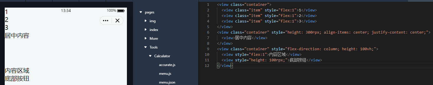
1. 水平等分布局
<view class="container">
  <view class="item" style="flex:1">1</view>
  <view class="item" style="flex:1">2</view>
  <view class="item" style="flex:1">3</view>
</view>
2. 垂直居中
<view class="container" style="height: 300rpx; align-items: center; justify-content: center;">
  <view>居中内容</view>
</view>
3. 底部固定按钮
<view class="container" style="flex-direction: column; height: 100vh;">
  <view style="flex:1">内容区域</view>
  <view style="height: 100rpx;">底部按钮</view>
</view>
五、实用技巧
- 多列布局:结合
flex-wrap: wrap实现瀑布流 - 间距控制:使用
gap属性(小程序基础库2.10.0+支持) - 滚动区域:父容器设置
overflow: scroll时,可能需要配合flex-shrink: 0 - 图片适配:常用
flex-shrink: 0防止图片被压缩
六、注意事项
- 小程序部分旧版本可能需要添加
-webkit-前缀 - 避免过度嵌套 Flex 容器
- 使用
min-width/min-height防止内容溢出
综上我们发现,Flex布局通过简单的属性组合即可实现复杂的响应式布局。
默认评论
Halo系统提供的评论